
A good newsletter design will help a publication stand out in readers’ inboxes — and keep them coming back. An intentional, consistent newsletter can make high-quality journalism shine and help the audience feel like their news needs are being met.
In this article, learn Indiegraf Experts insights about newsletter design best practices and principles, and get some email design inspiration from publishers.

Why is good newsletter design important?
Before your subscribers become supporters, you must convince them that your email newsletter is worth their time. The best newsletters feature a visual presentation that elevates readers’ experience, making finding the information they seek easier and more pleasant. Intentional newsletter design will add more value to your news product.
The best designed newsletters guide readers through the email layout, highlighting key information and influencing readers to take action, whether that’s clicking on an article or making a financial contribution.
You might be interested in: “Why I ask our publication’s supporters why they give” by Sam Hoisington, founder of The Bentonville Bulletin.
How to approach good newsletter design
As an extension of the brand, the newsletter should convey the mission of your journalism. If you don’t have brand guidelines, answer this question: how should people feel after reading my newsletter?
From there, pick fonts and colors that match the style and tone of the newsletter’s content. These visual elements can convey emotions in the same way as an editorial voice. For example, rounded edges and sans serif fonts feel more approachable; whereas sharp edges and serif fonts convey knowledgeability and authority.

A good rule of thumb is to pick no more than two fonts and colors (aside from black and white) for a newsletter.
Once you’ve got your visual identity basics down, it’s time to think about what exactly to include in each issue of the newsletter.
What is the best layout for a newsletter?
Treat the newsletter as a separate news product from the website and social media channels. What are the needs of your newsletter readers, and how can you meet them?
Here are common sections that many publications include in their newsletters:
Newsletter introduction
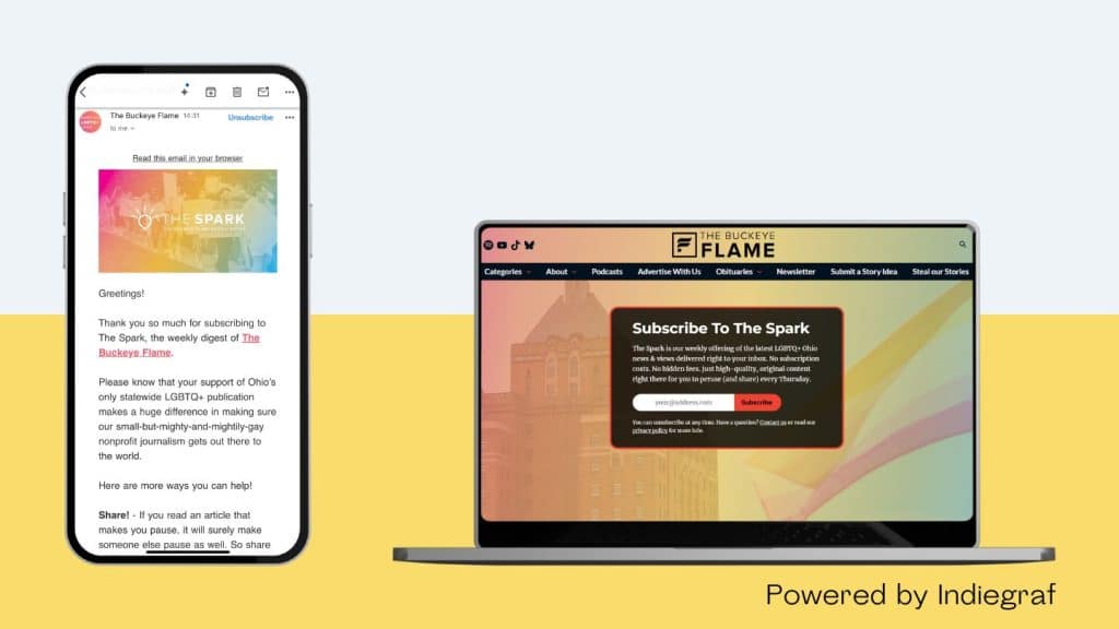
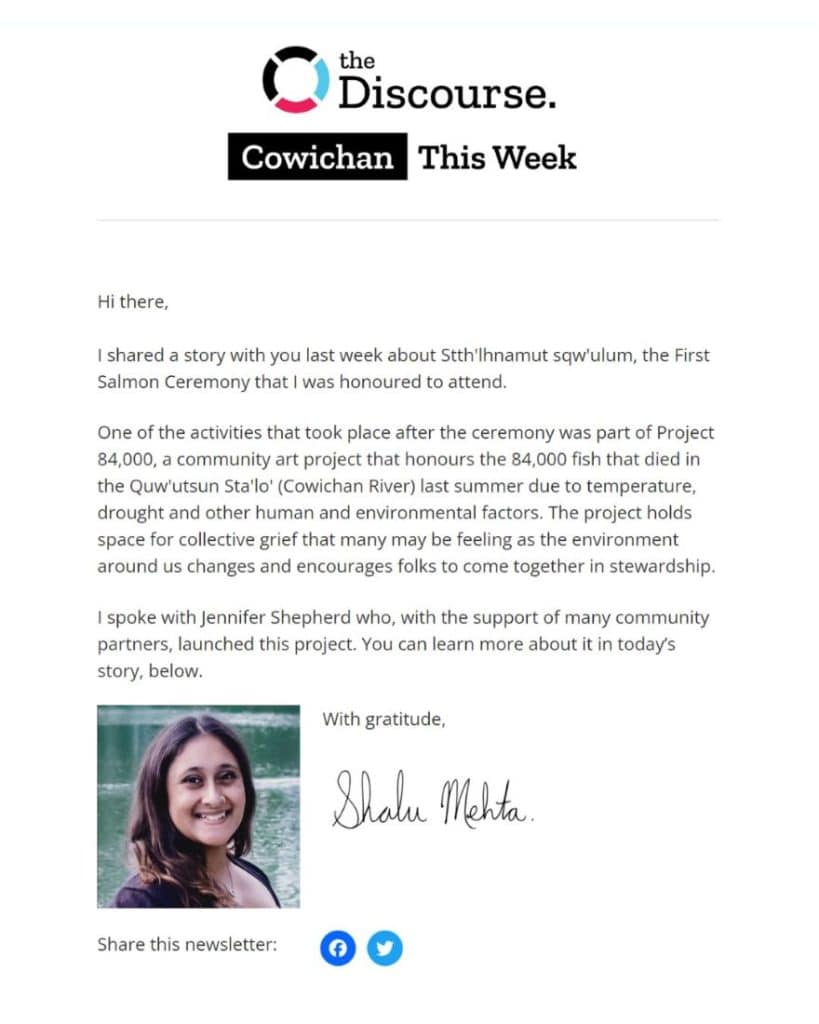
Many publishers like The Discourse and the Tri-Cities Dispatch include a one to two-paragraph greeting from a journalist or newsletter editor. This helps make the newsletter feel more personal and is a great way to build a bond with your readers.
Stories and articles
It’s best practice for email newsletters from news publications to include their latest articles. There are a few ways to do this.
- Feature a main story at the top (like Tone Madison).
- List all the recent stories (like Sun Peaks Independent News).
- Include only the headlines and descriptions (like The Guardian) to drive people to your website.
- Display a preview of the first few paragraphs of a story (like RANGE) to get readers to stay engaged in their inbox.

Other stories from the community
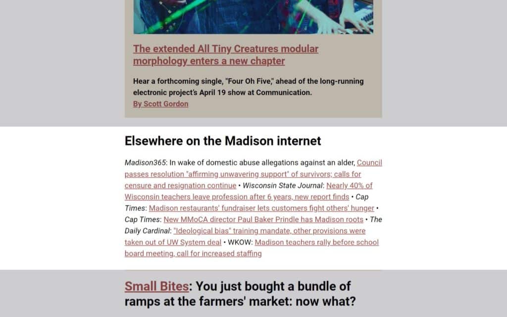
If your publication has specific coverage areas, you can spotlight articles from other publishers that may be of interest to your readers, like Tone Madison.
Reader thoughts
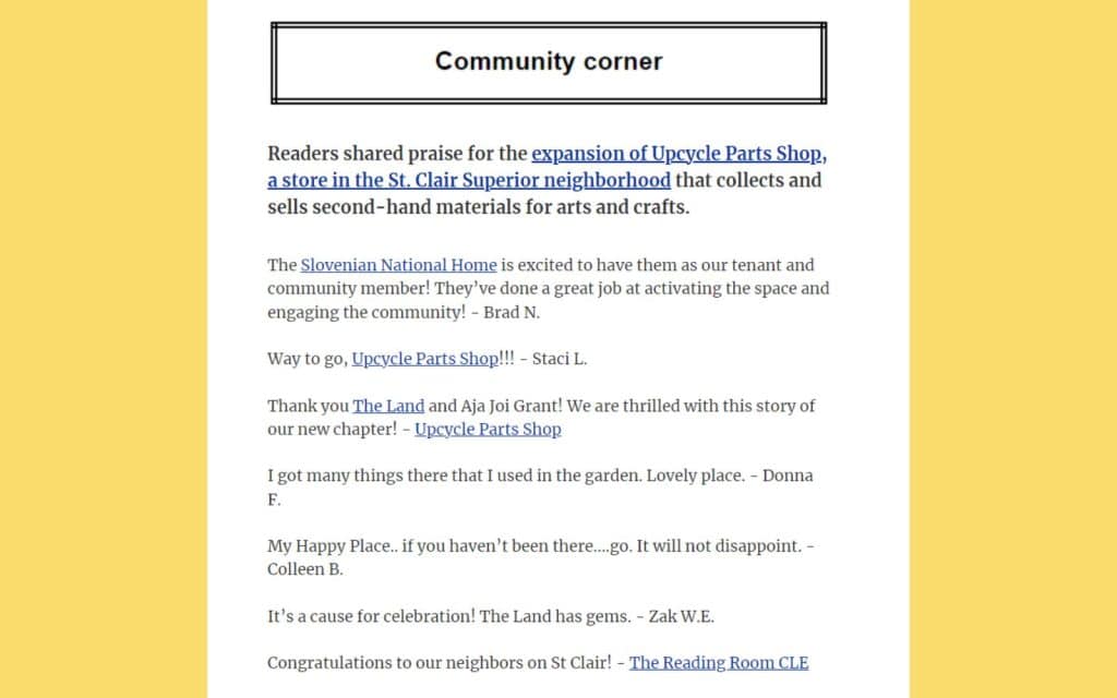
If your news organization prides itself on community engagement, a section that spotlights two-way dialogue is a great way to show, not tell. You can include article feedback from social media (like The Land), the comments section from the website, or testimonials collected from an audience survey (like The Discourse).
Upcoming events
If part of the newsletter’s value proposition is connecting readers with other like-minded people, or being a resource for learning, you can curate events from social media or the community to share (like The Ridge).

Job board
If you are an industry-specific newsletter (like INNovation and NPA’s Product Notes), you may want to share jobs from your network.

Something fun
If you want your newsletter to feel warm, fun, or approachable, you can include a song of the week in an intro (like The Palm Springs Post) or end off the newsletter with a photo taken by a reader (like The Ridge).

Why you should follow newsletter design best practices
How many times have you deleted an email because it felt irrelevant, unuseful, or simply too much work to read? The quality of a news newsletter’s journalism matters just as much as the reader’s experience. Being intentional about how your newsletter looks — and what’s in it — will help build loyalty among the audience.
For each section of the newsletter, identify what need it is meeting, how important it is to the audience, and how it helps support the media outlet’s mission and brand. This will help identify what to include and where to put it.
There are different ways to approach this. For example, you might want to start off with reader feedback or a fun anecdote to set the tone; or keep the events or job board at the bottom of the newsletter so readers have an incentive to scroll through the entire email. The 99 Newsletter Project is a great resource with a library of newsletters that is free to browse through for inspiration.
But remember, it all goes back to the audience. Regularly survey your audience on whether your newsletter meets their needs, and adjust accordingly.

Best practices for good newsletter design
Visual design, color theory, and user experience are endless rabbit holes — there’s a reason people go to school for this — but keep these newsletter design best practices in mind to keep it simple.
Tip 1: Use visual hierarchy in your newsletter
Create and consistently use a visual hierarchy to signal levels of information. This means strategically using size, color, contrast, alignment, repetition, proximity, white space, and texture and style to delineate different sections, headings, and body text. For example, if first-level headings are 30 pt size, keep second-level headings 24 pt size, and body text 16 pt size. This shows that the smaller the text gets, the more in-depth the content is.
Tip 2: Use newsletter templates to keep it easy
Email service providers like Indiegraf allow newsletter publishers to customize newsletter templates to reflect a visual hierarchy using global settings and saved modules. For example, users can make it so all headings appear the same without having to edit each block individually.
Tip 3: Optimize your email newsletter images
Anyone with newsroom experience knows how powerful visuals can be for boosting content engagement. Photos and infographics are great tools for storytelling. Choosing the right images for your emails can grab readers’ attention and hold it, adding essential context, clarity, and making your message more memorable.
Learn how creating a newsletter with the right image formats, sizes, and placements can boost readability and conversions in our comprehensive guide.
Read more 📖 “Email newsletters 101: A complete guide for independent publishers and journalists” to find out how to craft effective email newsletters that boost audience engagement and revenue growth.
Email design tips
✔️ Do
- Use the same colors for the same kind of information. For example, if all article links are blue, use green for a ‘Donate’ button.
- Use padding and dividers (sometimes called spacers) to separate sections.
- Keep font and text size across all headlines and body text consistent.
- Use a border or shaded background to call out important information, like announcements or calls-to-action.
- Make sure your emails are accessible. For example, there should be enough contrast between your text and background colors. Avoid putting too much text on images.
- Preview emails on desktop and mobile to make sure everything is legible on both devices.
❌ Don’t
- Use colors and fonts outside your brand guidelines.
- Leave too little white space between sections. Extra space (or padding) between sections helps readers understand they’re about to enter a new section.
- Use font sizes below 16 pt for body or heading text.
- Use fonts that are hard to read, like those that mimic handwriting.
- Vary the size and color between same-level headings or body text. For example, all body paragraphs should be the same size.
- Use more than two styles to put emphasis on text. For example, you don’t need to bold, highlight, and change the color of a sentence.
Following newsletter design best practices is just one part of the puzzle of growing a publication. For more resources, Indiegraf has put together a guide with 12 tips and strategies from Indiegraf Experts for creating a stellar newsletter.
Indiegraf has helped over 120 publications across North America start, grow and manage an independent news business. Interested in joining Indiegraf’s growing network?


